Project Description
My first responsive-design website project
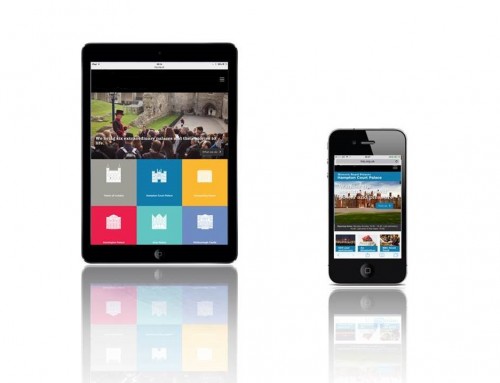
My first immersion in Responsive Design was the project management role at Sony in 2013. My brief was to manage the build and integration of a Customer Experience Management (CxM) platform to support a new ‘responsive web’ experience for this global entertainments business. A fundamental requirement for this project was that the design had to be responsive down to tablets, so the user experience switches from 3 to 2 columns across devices as the user reduces the width of the browser window.
Agile methods were used to manage the design, build and launch. Key work-streams for this responsive website design project were the same as for non-responsive sites I have delivered:
- Front end / user journey design
- solutions architecture and tech design
- Front end development
- Middle tier development and CxM integration
- Content creation and migration
- Test and bug-fix
- Launch
The business-case for this project pivoted on a successful migration to Adobe Experience Cloud hosted on Amazon Web Services. The AWS platform delivered the benefits of improved global reach, improved resilience and access to ‘out of the box’ features that would encourage web traffic and improve conversion. Technicalities of the cloud migration are addressed in more detail on my portfolio webpage covering replatforming projects. Also relevant is a recent article I’ve posted on my professional blog which explores the ‘three most popular cloud migration paths‘ all of which I used in recent years.
My time at Sony marked a turning point in the internet business for public facing website development towards ‘mobile first design’ as mainstream content platforms delivered this capability out of the box.
Why web designs must be responsive to mobile
[Written in 2014 – this section remains valid today in 2020] Web analytics for most public facing website will confirm that the majority of website visitors are using mobile devices. Applying mobile-first principles to responsive web design will lead to a ‘mobile friendly’ user experience and is now generally regarded as good practice.
Responsive CMS platforms use ‘css media queries’ to change styles on the fly, based on the characteristics of the target device (hight, width, type etc). The outcome is that the web-pages fluidly adapt to the size of the screen. This enables developers to create one set of templates that will cover all platforms. It also means that producers can create one set of content which is automatically repositioned. Mobile visitors now form the majority of the traffic for most websites, so the trend is now to apply ‘mobile first’ principles to website design and content creation.
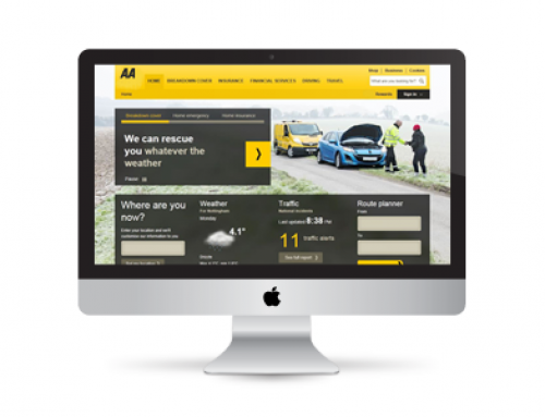
Google prefers ‘mobile friendly’ websites, so while an adaptive design site may continue to rank, any related ‘non-mobile-friendly’ desk-top version will slip down the rankings on Google. Adaptive design may be favourable for custom web-applications that are designed to run on specific mobile devices and/or may be accessible via internal WiFi. These web-apps can tailored to the hardware and balance speed with ergonomic and aesthetic considerations for example Museum Apps, Digital Visitor Guides, mapping/navigation solutions, industrial/commercial/logistical applications, public services applications etc.


