
Project Description
A mobile solutions for small or big businesses
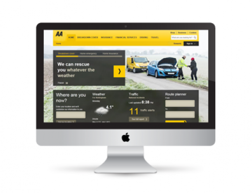
I designed these low cost mobile web-apps, based on static page layouts that are tailored to specific page widths. The content is optimised to render perfectly on mobile devices with specific screen sizes. A year after launching my own web-app, I replicated the same design for one my global clients and integrated it into their back end services and business functions. This adaptive mobile site was used for several years as the main mobile retail channel to market for UK customers. … Read More>
Features and benefits of these web-app designs are:
- Can be connected to back-end services (such as CRM or payment systems).
- Easy to update the content through a CMS.
- Short lead time to design and low cost to build, launch and maintain.
- Supports the branding and business rules consistent with the main website.
- Capable of scaling up for high visitor traffic volumes as the as the online mobile business takes-off.
- The core product design can be replicated.
- Feels like an app: Response times are speedy and efficient as the content is an optimised version of the main website with a light weight page design.
- Customers like using it.
The Background: I deigned my first adaptive mobile website, in my spare time, to cater for the growing volume of mobile visitors landing on my Travel to Olympics website. Originally designed for an iPhone 6 or similar sized Android device to provide quick and efficient operation over 3G mobile. Visitors with 4G handsets experienced performance comparable to desktop machines on a good fast internet connection. All mobile sites were linked to Google Maps and sat-nav functions installed on the mobile device to guide visitors to their destinations.

Following the success of the Travel To Olympics website, I replicated the design for three other sites (below). This small portfolio of affiliate websites were designed to provide information about sporting venues, tourist and holiday destinations / venues:
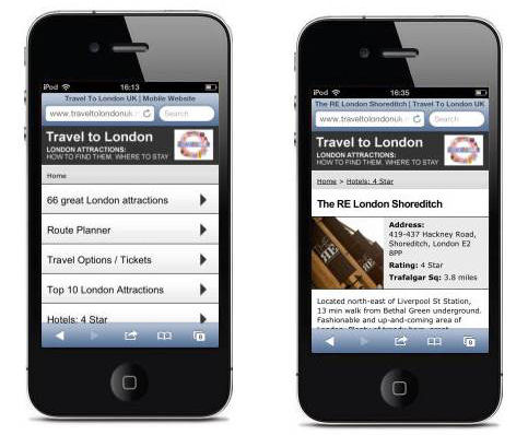
- Travel to London UK site is still up and running. The Adaptive site contains stripped down content with all the main features of the desk-top site, in particular: links through to the booking engines for the venues, hotels and travel companies, visitors can use either the desk-top or mobile versions to buy tickets in advance: Web address is www.TravelToLondonUK.mobi
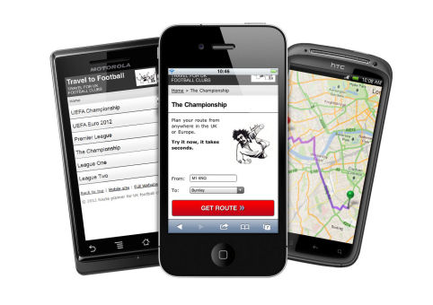
- Travel to Football is a development of one of the early prototypes. The site is still live, mainly for posterity. It provides directions to each football stadium in all of the top five UK football leagues and the UEFA Championship, however I have not updated the content on the site for a couple of years and have recently switched it off from search engines. It can still be reached on www.TravelToFootball.mobi
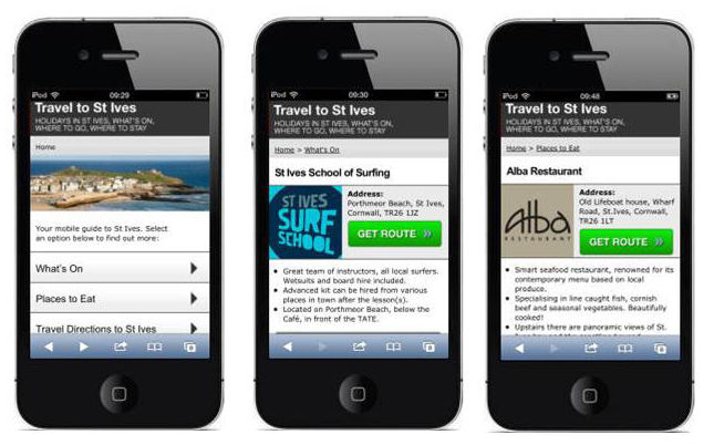
- www.TravelToStIves.mobi: The Adaptive Mobile site was decommissioned when the website was re-implemented on a mobile-responsive template. The (responsive) website remains on www.TraveToStIves.co.uk
- www.TravelToOlympics.co.uk was a not-for-profit site celebrating the 2012 Olympics, now decommissioned)
When visitors try to access the above URLS from mobile device with a screen size smaller than an iPad Mini, they are automatically redirected (away from the desk-top websites) to our mobile optimised sites. Visitors have the option to switch from between main (desk-top) and mobile versions from either site.The user experience includes route planners, travel advice, hotels and self catering accommodation listings and allow visitors to book tickets to venues.
These particular web apps formed part of a multi-channel on-line marketing initiative aimed at exploring the potential for combining desk-top and mobile with Social Media. The websites were set up as affiliate sites and delivered a small profitable revenue from visitors attracted to the sites via FaceBook, Twitter and Google (natural search and PPC).
Pros and Cons of Adaptive Design Website
The mobile sites were originally designed to provide quick and efficient operation over 3G mobile networks. Visitors with 4G handsets experienced performance comparable to desktop machines on a good fast internet connection. With the more recent proliferation in shapes and sizes of mobile devices, we would ideally need implement a new design and content variation for each screen size. The most common screen widths are currently:
- 320
- 480
- 780
- 960
- 1200
- 1600
Responsive mobile websites, on the other hand, are fluid and will automatically adapt to the size of any screen width and therefore the website will work on any target device.
The performance restrictions of 3G networks is no longer an issue across most of the UK with the arrival of 4G and now 5G mobile. There may be some applications where Adaptive Design is still preferred, for example web-apps designed and otpimised for specific devices. For most modern website requirements how-ever, it has become more normal to apply a ‘mobile-first approach to site design and content, as it is usually more economically viable to construct and maintain Responsive Websites that will work across all mobile platforms.
These were pioneering days in the development of mobile web design. I had great fun designing these web-apps and using them. I have also successfully deployed the design to a global business. The design concept has served me well.
There applications where Adaptive Design may be a preference where the web app is custom built to run on a particular device, for example museum apps, digital visitor guides, trade-show apps, etc.
These particular Adaptive Designs still work fine on larger format mobile phones, however, if I were building a new website (or need to re-platform the remaining sites) then I would now go for responsive site design as Google prefers it.


